Your website is often the first impression a potential customer has of your business, and you only get one chance to make it count. A poorly designed site can send visitors running to your competitors before they even read a single word. On the other hand, a well-built site can turn casual browsers into loyal, paying customers.
The good news? You do not need a massive budget or a degree in web development to get it right. You simply need to know what works. Small business web designs that succeed all share a set of core elements, and once you understand what those elements are, building an effective website becomes far less overwhelming.
In this post, we are breaking down the essential features every small business website needs to attract visitors, build trust, and drive real results. Whether you are building your first site from scratch or looking to improve what you already have, this list will give you a clear, actionable roadmap to follow. Let’s get started.
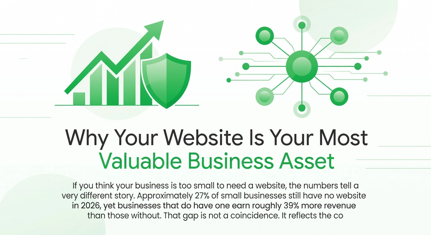
Why Your Website Is Your Most Valuable Business Asset
If you think your business is too small to need a website, the numbers tell a very different story. Approximately 27% of small businesses still have no website in 2026, yet businesses that do have one earn roughly 39% more revenue than those without. That gap is not a coincidence. It reflects the compounding value of being discoverable, credible, and operational online at all times.
The opportunity is significant, and Australian SMEs are paying close attention. The Australian web design services industry is now valued at approximately $1.5 billion in 2026, growing at an annualised rate of around 1.4%. Local businesses, from sole traders to mid-sized teams, are investing seriously in their digital presence, recognising that a well-built website is not an expense but a long-term asset.
So what does a small business website actually do? Far more than most beginners expect. A professionally built site functions simultaneously as a 24/7 sales representative that captures leads and converts visitors without staff involvement, a credibility signal that builds trust with potential customers before they ever contact you, and an operational tool that can handle bookings, payments, customer portals, and integrations with your existing systems. The role your website plays depends entirely on how it is designed and built.
The spectrum of what a small business website can be is wide. At one end, a simple five-page site covers your services, story, and contact details. At the other end, a custom web application or client portal handles complex workflows, user accounts, and automated processes. Neither is inherently better. What matters is aligning your website to your actual business goals before a single line of code is written.
This clarity is urgent. Over 87% of small business owners intend to build or improve their websites, which means inaction today is a competitive disadvantage tomorrow. The businesses gaining ground are the ones starting with the right foundation.
1. A Mobile-First Design That Actually Works on Any Screen
Mobile devices now account for approximately 60–70% of global web traffic, and Australia sits firmly among the highest mobile-adoption markets in the world, with smartphone connections exceeding the total population. That means the majority of people landing on your small business website are doing so from a phone, likely while commuting, browsing during a break, or searching for a local service on the go. If your site is not built with mobile users as the primary audience, you are effectively turning away more than half your potential customers before they have even read a single word.
Mobile-first design is not simply a matter of shrinking your desktop layout to fit a smaller screen. It is a deliberate design philosophy that starts at the smallest viewport, typically around 375 pixels wide, and builds upward. This approach forces you to make hard decisions about what content truly matters. Layout hierarchy must put your most critical information and calls-to-action within easy thumb reach. Tap targets such as buttons, links, and form fields need to be large enough to tap accurately, with a minimum of 48×48 pixels recommended. Text must scale using relative units so it remains readable without the user needing to pinch and zoom. Navigation must collapse into simple, touch-friendly menus rather than relying on hover states that simply do not exist on touchscreens.
Common mobile failures seen across small business websites include:
- Buttons that are too small or too close together to tap reliably
- Body text set at fixed small sizes that force users to zoom in
- Contact forms with tiny input fields that are frustrating to complete on a touchscreen
- Uncompressed images that inflate page load times and trigger high bounce rates
These problems almost always stem from a desktop-first design that was poorly adapted after the fact, rather than being built mobile-first from the outset.
Responsive frameworks combined with a correctly configured viewport meta tag are now baseline requirements in 2026, not optional enhancements. More critically, Google’s mobile-first indexing means Google ranks your site based primarily on its mobile version. A broken or slow mobile experience directly suppresses your search visibility, making mobile optimisation both a user experience issue and an SEO imperative.
For a quick audit of where you currently stand, run your site through Google PageSpeed Insights at pagespeed.web.dev. Critically, also test on a real physical device rather than just resizing your browser window. Emulators miss real-world touch behaviour, rendering inconsistencies, and true load times on mobile networks. Check Google Search Console for mobile usability reports, which will flag specific issues like clickable elements being too close together or content wider than the screen. Fixing these is one of the highest-return improvements any small business website can make.
2. Page Speed and Performance That Keeps Visitors From Leaving
Speed is not a luxury feature for small business websites. It is the baseline expectation every visitor arrives with, and failing to meet it costs you real customers.
Research consistently shows that 53% of mobile users will abandon a site that takes longer than 3 seconds to load, and the broader picture is even more sobering. Up to 88.5% of users report leaving a website entirely because of slow loading or poor performance. Think about that in practical terms: if your site takes 4 or 5 seconds to appear, the majority of people who clicked through to find you are already gone before they have read a single word.
Beyond user frustration, speed has a direct line to revenue. 43% of small businesses are actively planning to invest in page speed and performance improvements in 2026, recognising that a slow site is not just a technical inconvenience but a measurable drag on sales, leads, and growth. Every second of delay reduces conversions, increases bounce rates, and signals to potential customers that your business may not be as professional as your competitors.
What Is Actually Slowing Your Site Down
Most small business sites suffer from the same set of avoidable problems. Unoptimised images are the most common culprit, where large photo files that have never been compressed eat up bandwidth on every page load. Excessive plugins add layers of scripts and database requests that compound quickly, particularly on WordPress-based sites. Cheap shared hosting limits your server resources, meaning your site queues behind dozens of others before it even begins responding. Unminified JavaScript sends bloated, uncompressed code to the browser instead of a streamlined version. And without a content delivery network (CDN), your files are being served from a single server location, adding latency for anyone not physically nearby.
Understanding Google’s Core Web Vitals
Google measures performance through three specific benchmarks called Core Web Vitals, and these directly influence your search rankings as well as how visitors experience your site.
- Largest Contentful Paint (LCP) measures how quickly the main content on your page becomes visible. Think of it as how fast the “important stuff” appears. Google wants this under 2.5 seconds.
- Interaction to Next Paint (INP) measures how quickly your site responds when someone clicks a button or taps a menu. A poor score makes your site feel laggy and unresponsive. The target is under 200 milliseconds.
- Cumulative Layout Shift (CLS) measures visual stability. If elements jump around as the page loads and cause visitors to accidentally tap the wrong thing, that is a CLS problem. A score of 0.1 or below is considered good.
You can check all three for free using Google PageSpeed Insights.
Why Custom Builds Outperform Template Sites Over Time
A well-built custom site loads only the code it actually needs. Template-heavy builds, by contrast, carry enormous amounts of unused functionality bundled into every page load. As small businesses add plugins and features over time, performance on these sites degrades progressively, making them harder to maintain and slower to serve. A purpose-built site avoids this accumulation from day one, keeping load times fast and the codebase clean as your business grows.
3. Clear Calls to Action That Tell Visitors What to Do Next
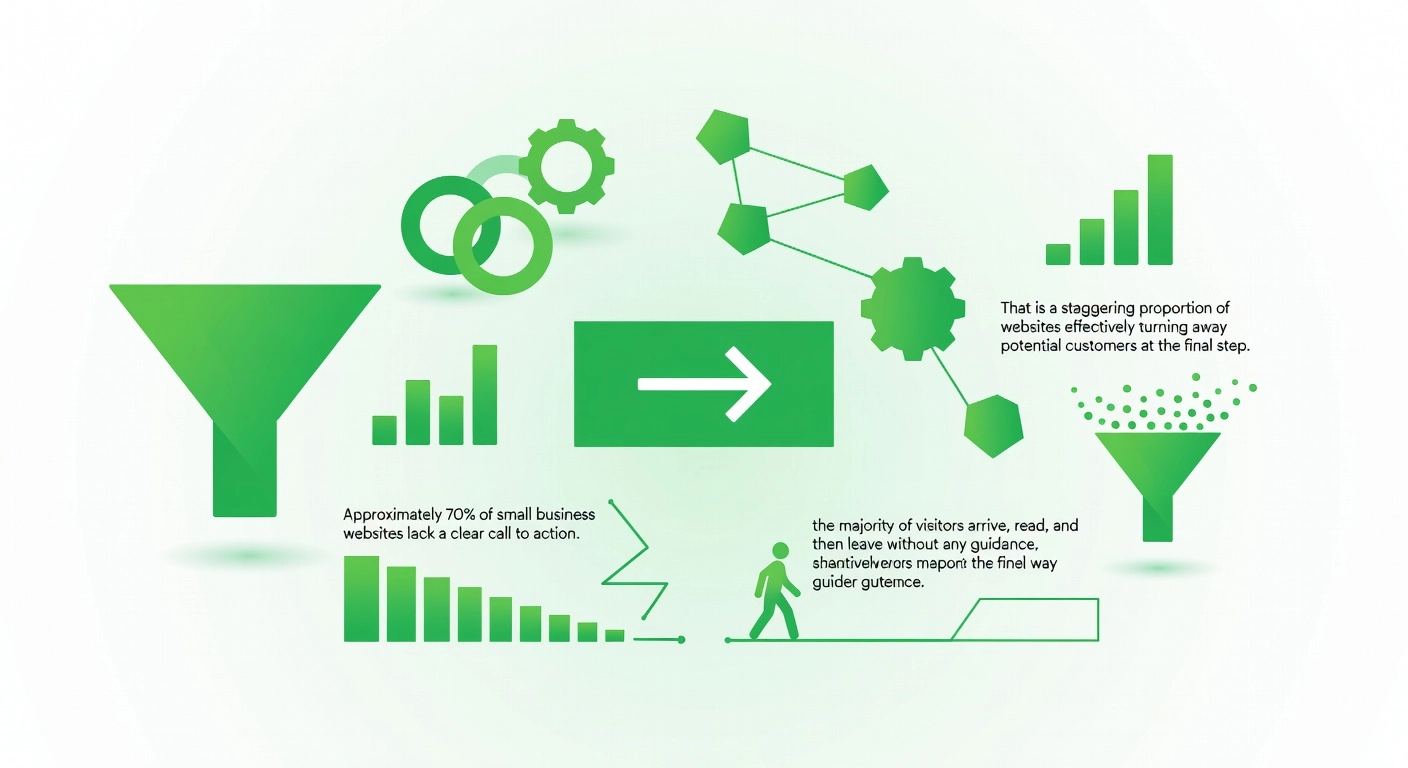
Approximately 70% of small business websites lack a clear call to action, meaning the majority of visitors arrive, read, and then leave without any guidance on what to do next. That is a staggering proportion of websites effectively turning away potential customers at the final step. You may have invested in professional copy, strong visuals, and fast load times, but without a clear CTA, all of that effort delivers no return. Every page your visitor lands on needs to answer one unspoken question: “What should I do now?”
A CTA Is the Logical Conclusion of Every Page
A call to action is not simply a button sitting at the bottom of a page. It is the purposeful endpoint of everything that page sets out to accomplish. A services page should lead visitors toward booking a consultation or requesting a quote. A blog post should invite readers to download a related resource or subscribe for more insights. A product page should point clearly toward a purchase. Each page on your site has one primary job, and the CTA is how that job gets done. When a page tries to achieve five things at once, it typically achieves nothing.
Common CTA Mistakes That Cost You Conversions
The most frequent errors are also the easiest to overlook. Vague labels like “Click Here,” “Submit,” or “Learn More” tell visitors nothing about what they will receive or why they should act. Burying a CTA below the fold means a large portion of visitors will never see it. Cramming multiple competing actions onto a single page creates decision paralysis, and visitors default to inaction. Perhaps most damaging is mismatching the CTA to the visitor’s intent; pushing a hard “Buy Now” on an awareness-stage page feels jarring and premature.
Fix Conversions Before Chasing More Traffic
According to Forbes Advisor, 21% of small businesses cite low traffic as their top website challenge. However, research from MarketingLTB consistently highlights that poor conversion of existing traffic is equally damaging and often cheaper to fix than running additional ad spend. Improving your CTAs costs nothing compared to a paid campaign, yet it can meaningfully increase the results you get from visitors already finding your site.
Start with a simple audit: visit every page on your website and ask, “What do I want someone to do when they finish reading this?” If the answer is not immediately obvious from the layout, copy, and button placement, the CTA needs work. Replace vague labels with specific, benefit-driven language such as “Book Your Free Consultation” or “Get a Custom Quote Today.” Place your primary CTA above the fold where it is visible without scrolling, and limit each page to one dominant action with any secondary options visually de-emphasised.
4. Trust Signals and Social Proof That Convert Sceptical Buyers
Every first-time visitor arrives at your website as a stranger. They have no history with your brand, no referral to rely on, and no reason to trust you yet. Research into small business website design trends for 2026 confirms that trust must be established within seconds, before a visitor decides whether to stay or leave. Getting this right is not optional; it is one of the most direct levers you have for turning traffic into actual enquiries.
Show Real Evidence From Real Clients
Generic claims like “we’re the best” carry no weight with a sceptical buyer. What works is specific, verifiable evidence. Client testimonials that include a person’s full name, job title, and ideally a photo are far more persuasive than anonymous quotes. Case study summaries that reference measurable outcomes, such as leads generated or time saved, demonstrate capability in concrete terms. Recognisable client logos, industry certifications, association memberships, and any media mentions all serve as third-party validation that reinforces credibility without you having to argue for it yourself.
Design Quality Is a Trust Signal Too
Leading web design practice for 2026 highlights that visitors form an impression of your professionalism almost immediately based on visual presentation alone. Research from Stanford’s Web Credibility Project, widely cited across the industry, found that 75% of consumers judge a company’s credibility based on its website design. Professional photography of your actual team and work, consistent use of brand colours and fonts, careful typography, and a logical visual hierarchy all communicate that your business takes quality seriously. Inconsistent or cluttered design quietly signals the opposite.
Remove the Technical Barriers to Trust
Security indicators play a quieter but equally important role. An SSL certificate (visible as HTTPS and a padlock in the browser bar), a clearly linked privacy policy, and prominent contact details including a physical address and phone number reduce the anxiety that often stops visitors from taking the next step. Burying your contact information or omitting it entirely is a common mistake that signals either inexperience or a reason to hide. Display these details in your header or footer so they are present on every page.
Put a Human Face on Your Business
For service-based businesses especially, a concise “About” section that introduces the people behind the work creates a meaningful point of difference. Visitors connect with faces, stories, and stated values in ways they simply cannot connect with a logo. Sharing who your team is, why the business exists, and what you genuinely care about differentiates you from faceless providers and builds the kind of familiarity that encourages someone to reach out. People consistently choose to work with businesses they feel they understand and can trust.
5. Accessibility and WCAG Compliance — A Legal and Ethical Requirement
Accessibility is no longer optional for Australian small businesses. Under the Disability Discrimination Act 1992 (DDA), businesses of all sizes, including sole traders and startups, are legally required to ensure their digital services do not discriminate against people with disabilities. The Australian Human Rights Commission has reinforced this by recommending alignment with WCAG standards, with updated guidance citing WCAG 2.2 Level AA as the current benchmark. Non-compliance can result in formal complaints, Federal Court escalation, and compensation settlements reaching into the tens of thousands of dollars. With approximately 5.5 million Australians living with disability, inaccessible websites also exclude a substantial market segment from engaging with your business.
The most common accessibility failures are also among the easiest to overlook during a standard build. Low colour contrast ratios make text unreadable for users with low vision. Missing alt text on images leaves screen reader users without context. Navigation menus that cannot be operated with a keyboard alone shut out users who rely on assistive technology. Unlabelled form fields create confusion for anyone using a screen reader to complete a purchase or enquiry. Video content without captions excludes deaf and hard-of-hearing visitors entirely.
Importantly, fixing these issues improves the experience for every visitor, not just those with disabilities. Proper semantic HTML structure, descriptive link text, and logical heading hierarchies also improve how search engines crawl and index your site, directly supporting your SEO performance.
Automated tools like WAVE and Axe are practical starting points that flag common violations quickly and at low cost. However, they cannot detect every issue. Complex navigation patterns, logical reading order, and dynamic content interactions require manual review by an experienced developer or accessibility specialist.
Small businesses commissioning a new site in 2026 should treat WCAG 2.1 AA as the non-negotiable minimum and confirm testing protocols with any studio or developer before the project scope is finalised.
6. SEO Foundations That Help Customers Find You Organically
Good design and strong SEO are not separate disciplines. They are two sides of the same coin, and the most effective small business web designs treat them as inseparable from day one.
Technical SEO is built in, not bolted on. The foundations that help search engines crawl and rank your site include clean URL structures (short, descriptive, and hyphenated), a logical heading hierarchy from H1 through to H3, fast load times that meet Google’s Core Web Vitals thresholds, XML sitemap submission, canonical tags to prevent duplicate content issues, and schema markup that tells search engines exactly what your business does. These elements should be engineered into your site’s architecture during the initial build. Retrofitting them later is possible, but it is expensive, often incomplete, and rarely as effective as getting it right from the start.
On-page SEO starts with your customers’ actual language. Before writing a single word of page copy, research the specific search terms your potential customers type into Google. These are often long-tail phrases like “affordable bookkeeper in Brisbane” rather than broad terms like “accountant.” Once you have those terms, structure each page’s title tag, meta description, headings, and body copy around them naturally. Avoid forcing keywords into every sentence; search engines in 2026 reward content that demonstrates genuine expertise and answers real questions clearly.
Local SEO is non-negotiable for Australian businesses. Your Google Business Profile is arguably your most powerful local ranking tool. Keep it fully completed with accurate name, address, and phone (NAP) details, current photos, and regular posts. That same NAP data must be consistent everywhere your business appears online, including directories and social profiles. Inconsistent details create confusion for both search engines and potential customers.
Zero-click and AI-powered search are reshaping discovery. A growing proportion of searches now resolve without a click, as Google’s AI Overviews surface direct answers. Structured data, concise answer-formatted content, and clear topical authority help your business get cited within these results, building visibility even when users never visit your site.
Finally, template-based or poorly coded websites quietly accumulate SEO technical debt. Render-blocking scripts, bloated markup, and thin duplicate content create persistent ranking headwinds that even excellent written content cannot overcome. A custom-built site with clean, optimised code removes those obstacles entirely.
7. Brochure Site or Custom Web Product — Knowing Which One Your Business Needs
Not every small business needs the same type of website, and choosing the wrong one is one of the most common and costly mistakes you can make at the design stage.
Understanding what a brochure site is and when it fits
A brochure site typically spans five to ten pages covering the essentials: services, about, contact, and perhaps a blog or testimonials section. It functions like a digital business card, delivering clear information to visitors and encouraging them to call, email, or submit an enquiry form. For many small businesses starting out, this is exactly the right tool. A local trades business, a consulting practice, a clinic, or a newly launched service provider generally needs visibility, credibility, and a reliable channel for inbound leads. A well-built brochure site delivers all three without unnecessary complexity or cost.
When a custom web product becomes the right choice
A custom web product is a different category of solution entirely. This includes client dashboards, internal staff portals, booking and scheduling systems, e-commerce platforms, SaaS tools, and web applications built around specific workflows. These are appropriate when your business needs to automate a process, serve users dynamically, manage data at scale, or support operational growth that a static site simply cannot accommodate. If your customers need to log in, complete transactions, access personalised information, or interact with your systems in real time, a brochure site will not meet those needs regardless of how well it is designed.
The core question to ask before you build
The decision comes down to one practical question: what job does this website actually need to perform? Passive information delivery and credibility building point toward a brochure site. Active user interaction, data handling, integrations with payments or calendars, and workflow automation point toward a custom web product. Getting this distinction right at the planning stage prevents a very common and expensive outcome.
Many small businesses launch with a template-based brochure site, then discover 12 to 18 months later that the functionality they need cannot be retrofitted without a full rebuild. Planning for growth during the initial design phase, even if that simply means choosing a more extensible foundation, saves significant time and budget later.
Studios like Pixeldev specialise in building custom web products and applications for small teams and startups, handling everything from modest indie launches priced under $5,000 to complex seed-funded builds exceeding $150,000, depending on scope and integration requirements. Having a development partner who understands both the brochure site starting point and the custom product destination means your initial decisions are made with the full roadmap in mind.
8. Transparent Pricing — What a Small Business Website Actually Costs
Understanding what a professional website actually costs is one of the most important steps a small business owner can take before approaching any studio or freelancer. Pricing in this industry varies enormously, and without a clear picture of what drives those numbers, it is easy to make a decision that costs far more in the long run.
What you should expect to pay for the build itself depends heavily on what you are building. Template-based or lightly customised sites from freelancers typically sit in the $2,000 to $8,000 range, while boutique agency builds with custom design, strategy, and proper development commonly fall between $8,000 and $15,000 or more. Fully custom web applications, portals, or complex e-commerce platforms push significantly beyond this, often into the $30,000 to $150,000+ range depending on scope and functionality. Studios like Pixeldev work across this full spectrum, from indie launches under $5,000 through to seed-funded builds exceeding $150,000.
Ongoing maintenance is the cost most small businesses fail to budget for. After launch, a professional website requires regular updates, security patches, backups, hosting, performance monitoring, and technical support. Industry figures consistently show small businesses should budget between $50 and $500 per month, or $600 to $6,000 per year, depending on site complexity. Skipping maintenance does not eliminate this cost; it simply defers it until something breaks at the worst possible moment.
Before signing any agreement, ask exactly what happens after launch. Many quotes cover the build and nothing else. You need to know whether post-launch support is included, who you contact when something goes wrong, and who legally owns the code and domain. These are non-negotiable questions, not optional ones.
A discovery phase is one of the highest-value investments you can make early in the process. Typically costing a fraction of the total build, a proper discovery phase investigates your business goals, user needs, and technical requirements before a single line of code is written. It significantly reduces the risk of building something that misses the mark and requires expensive revision later.
Watch for these red flags in any pricing proposal: no written scope document, vague or absent post-launch terms, no clarity on code or domain ownership, maintenance excluded entirely, and quotes that seem unrealistically low. Prices that undercut the market usually signal corners being cut on planning, testing, or quality, and small businesses routinely end up paying twice to fix the result.
9. Post-Launch Maintenance — The Part Most Small Businesses Forget
Most small businesses invest significant time and money getting their website designed and launched, then treat it as a finished product from that point forward. This is one of the most expensive mistakes you can make. A website is a living system that requires continuous attention, and the moment you stop maintaining it, it begins to degrade.
The ongoing work your site demands includes security updates, dependency patches, content refreshes, performance monitoring, and compatibility fixes as browsers and devices evolve. What functions perfectly today may break silently six months from now when a browser updates its rendering engine or a third-party integration changes its API. Without someone actively watching for these shifts, your visitors encounter errors you never know about.
The Security Risk Is Real and Targeted
Unpatched websites are among the most common entry points for small business cyberattacks. Outdated plugins, expired SSL certificates, and abandoned codebases create exploitable vulnerabilities that attackers actively scan for at scale. Research indicates that 43% of cyberattacks specifically target small businesses, with outdated software cited as a contributing factor in a significant proportion of successful breaches. On common platforms, the numbers are stark: approximately 61% of WordPress-related attacks involve sites running outdated software.
The consequences extend well beyond a temporary outage. Breach costs can reach hundreds of thousands of dollars, and many small businesses never fully recover from a serious incident. Treating security updates as optional is not a cost-saving decision; it is a deferred liability.
Your Site Either Grows or Decays After Launch
The period after launch is where your website investment either compounds in value or quietly erodes. Businesses that treat their site as a living product, through regular content updates, performance tuning, and iterative improvements, consistently outperform those that do not. Fresh, optimised sites build credibility, support SEO rankings, and convert more visitors over time.
Structured maintenance retainers solve a practical problem many small businesses overlook: what happens when something breaks at the worst possible moment. Typical retainer arrangements cost between $50 and $500 per month and provide predictable budgeting, priority response times, and a clear escalation path rather than a frantic search for an available developer mid-crisis.
This is precisely the gap that Pixeldev’s discovery-build-operate model is built around. Rather than delivering a finished site and stepping away, Pixeldev structures its engagements as long-term partnerships that include maintenance, dependency upgrades, security oversight, and ongoing iteration well after launch. For small businesses that want a reliable partner from the first build through every update that follows, this model offers something the one-off build approach simply cannot: continuity.
10. Design Trends Worth Adopting in 2026 (And Which Ones to Ignore)
Design trends in 2026 reward restraint. For small businesses especially, the sites that perform best are those that apply trends purposefully rather than chasing every new visual idea that surfaces.
Trends Worth Adopting
Minimalist layouts with bold typographic accents remain one of the strongest design directions for small businesses this year. Strategic white space gives your content room to breathe, improves readability, and naturally draws the eye toward your most important messages. Pair that with a strong typographic hierarchy and you create a page that feels confident and polished without needing excessive visual complexity. Subtle micro-interactions are equally worth implementing. A button that shifts colour on hover, a form field that confirms submission, or a small animation that acknowledges a user action all communicate professionalism and responsiveness. These details reassure visitors that your site is alive and attentive. Restrained video backgrounds can add atmosphere to a homepage or hero section, but they must be optimised carefully. Given that mobile accounts for roughly 70% of global web traffic, any video that delays load time will cost you visitors before they see a single word.
Dark Mode and AI Personalisation
Dark mode support has moved from a nice-to-have feature into a genuine user expectation. Many visitors arrive with their operating system already set to dark mode, and a site that ignores this preference can feel visually jarring and out of step with the products they use daily. Implementing dark mode via CSS media queries is relatively straightforward and signals that your site has been built with care.
AI-powered personalisation is the more forward-looking trend worth planning for now, even if you are not ready to implement it immediately. Small businesses with repeat customers or distinct audience segments stand to benefit the most, as dynamic content can tailor messaging and calls to action based on user behaviour.
Trends to Use with Caution
Heavy parallax scrolling, excessive animation, and design-forward layouts that bury navigation all share a common flaw: they prioritise visual spectacle over usability. Parallax effects in particular raise accessibility concerns for users with vestibular sensitivities, and they consistently introduce performance issues on mobile. Excessive animation delays interaction and frustrates visitors who simply want to find information quickly. Form must always serve function.
The Clarity Principle
Above every trend sits one enduring principle: clarity. Within the first five seconds of landing on any page, a visitor should understand who you are, what you do, and what action to take next. A clear headline, a concise value statement, and a visible call to action will outperform any visual trend that obscures these fundamentals. Design trends come and go; this principle does not.
11. How to Choose the Right Web Design Partner for Your Business
Choosing the right web design partner is one of the most consequential decisions a small business owner will make, and it deserves more scrutiny than simply reviewing a portfolio and accepting a quote.
Match the portfolio to your actual requirements. A studio that has built twenty polished brochure sites may have no meaningful experience with booking systems, customer portals, or database-driven applications. Before engaging anyone, ask to see work built for businesses at a comparable scale and complexity to yours. If you need a client-facing portal or an automated quote system, request specific examples of those builds. Aesthetic quality matters, but functional capability matters more when your requirements go beyond static pages.
Ask direct questions about post-launch support before you sign anything. Many studios treat launch day as the end of their obligation. Ask whether they offer maintenance retainers, how bugs discovered after handover are handled, and what their average response time is for critical issues such as a site going offline or a payment integration failing. Ongoing website maintenance typically costs between $50 and $500 per month depending on complexity, and a studio that cannot clearly answer these questions is signalling that post-launch support is not part of their model.
Clarify ownership before a single dollar changes hands. Who owns the code? Who holds the domain registration? What access do you retain if you need to move to a different provider? These are non-negotiable clarity points. A reputable studio will hand over full source code, admin credentials, and documentation upon project completion. Vague answers here are a serious warning sign.
Treat transparent pricing and a formal discovery phase as quality indicators. Studios that provide detailed quotes only after a structured scoping process are demonstrating that they understand what they are building. Vague estimates produced without discovery are a risk indicator for scope creep and missed deliverables.
Finally, prioritise a partner with experience across the full product lifecycle. For a growing business, a studio capable of supporting you from initial design through ongoing operation and future iteration means you will not outgrow your developer within eighteen months and need to start the entire process again.
Building a Small Business Website That Works Long Term
A strong small business website in 2026 rests on six non-negotiables: mobile-first performance, clear calls to action, trust signals, accessibility compliance, solid SEO foundations, and a post-launch maintenance plan. Each element covered in this guide compounds the others. A fast-loading site earns nothing without a clear CTA. Excellent trust signals lose impact if the site fails on mobile. These elements work as a system, not a checklist.
The most important mindset shift any small business owner can make is recognising their website as an ongoing asset rather than a sunk cost. Businesses that invest in iterative improvements, regular maintenance, and performance optimisation consistently outperform those that treat launch day as the finish line. A website left untouched depreciates quietly through outdated content, security vulnerabilities, and falling search visibility.
Start by auditing your current site against every element covered here. Use free tools to check performance, mobile responsiveness, and accessibility. For a new build, bring a brief that addresses design, performance benchmarks, SEO strategy, accessibility standards, and a clear post-launch support plan from day one.
If you are ready for a transparent, senior studio partner that takes you from initial discovery through to long-term operation, Pixeldev is built for exactly that. They design, build, and maintain custom web products for small businesses, startups, and growing teams, locally and internationally, with clear pricing and a genuine commitment to long-term results.